Building a Stronger Brand with The Street Smart Website Refresh
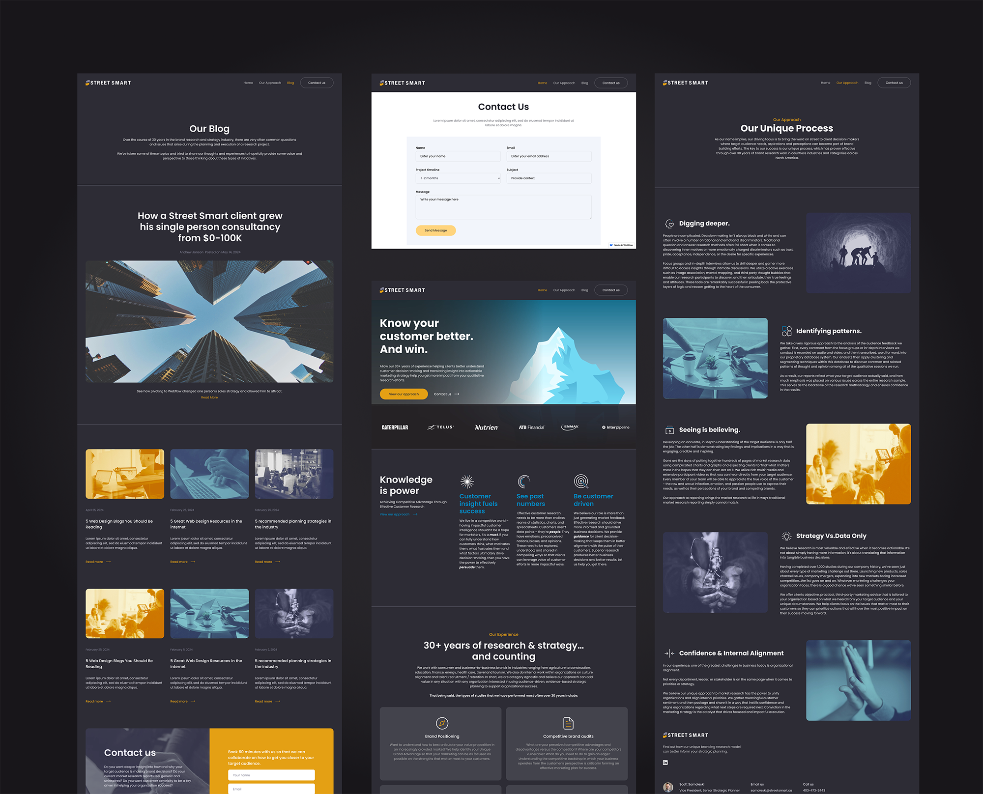
Redesigned and developed a Canadian marketing strategy firm's website to enhance visual appeal, UX, and SEO to showcase how customer insights drive brand building.
(4 min read)
Client
Street Smart
Service
UX/UI design, Art Direction, Front-end development
My Role
Product & Webflow Designer
Team
Solo
Street Smart is a leading Canadian marketing strategy firm specializing in customer insights and brand development sought to revamp its online presence to better reflect its expertise and services. The project focused on enhancing visual appeal, user experience, and SEO while integrating front-end design elements to effectively showcase how customer insights drive brand building.
What I did
I took the lead in redesigning and developing its website using Webflow, overseeing the project from start to finish. The revamped site features improved visual design, enhanced user experience, and optimized SEO.
UX audit to identify problems
The previous website had a few notable accessibility and usability issues that affected the overall user experience. Here are some of those challenges:
Lack of responsiveness: The website was not optimized for mobile devices, causing difficulty for users to access important information quickly. Considering that 50% of the website’s visitors were mobile users, this lack of responsiveness led to frustration and a poor user experience.
Navigation issues: The navigation menu only served as anchor buttons to a long, single-scrolling page. This design was overwhelming, as it forced users to scroll extensively to find the information they needed. It lacked clear organization, making it difficult for users to navigate efficiently.
Inconsistent visual design: The overall design of the website appeared disjointed and inconsistent. The visual and UI elements did not reflect the professional image of the brand, failing to create a cohesive and appealing experience. This undermined the trust visitors might have in the company.

Improvements
Let’s take a closer look at the details of the changes one by one so we can get a clear picture. To tackle the issues we've identified, here are the changes I made:
➊ Restructure the website
Organize content from the previous homepage into multiple dedicated pages.

➋ Upfront contact Call-to-action (CTA)
Take the contact call-to-action more visible and accessible by placing banners across pages that prompt users to take action after reading about the services. Also, ensure that the contact button in the navigation menu is prominent and easy to find.

➌ Improve responsiveness
Ensure the website is fully optimized for mobile devices to provide a seamless experience for users. This includes adjusting layout, text size, and interactive elements to fit various screen sizes.

➍ Rebranding the visual design
Revamp the color scheme to align with the brand’s professional image. Select a palette that conveys trust and credibility. Additionally, update the image style to match the desired tone and mood of the brand, ensuring a modern, cohesive aesthetic.

➎ Add client logos and testimonials
Include logos of well-known partners or clients and testimonials from satisfied customers. These elements will help establish trust and credibility, reassuring visitors about the quality of services provided.

➏ Incorporate a Blog for SEO
Add a blog section with relevant, insightful content that can boost SEO rankings. The blog should address topics related to the brand’s services, providing valuable information for users while improving visibility on search engines.

No items found.
Outcome
The redesigned website boasts an improved visual aesthetic, an enhanced user experience, and optimized SEO to better engage visitors. Overseeing the project from start to finish, I ensured a seamless transformation that aligned with the firm's objectives and audience needs.
To support ongoing maintenance, I also created a comprehensive handbook, enabling the client to independently edit basic features with ease.


%402x.svg)